A look at Interior Design Trends 2013
Earlier this fall, we were thrilled to attend Boston Design’s Center, The Look, a full day of fabulous showroom exhibits, seminars, and presentations. To kick-start the day, we went to the 2013 Trends seminar to whet our palettes for what’s to come in the world of interior design. Here are the colors to be on the look out for in 2013.
Mellow Yellows
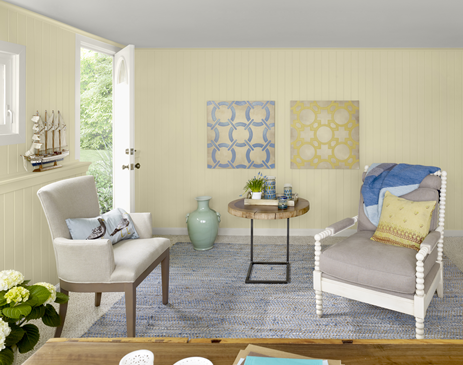
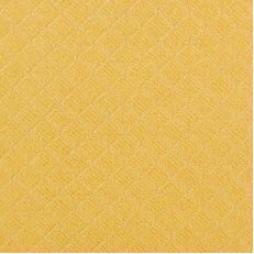
These colors are warm and inviting. Think dusky yellows, mustards and ambers like this Duralee solid in the image below. Don’t be afraid to try using pale yellow as a neutral or amber as a stand-in for gold. Benjamin Moore’s Color of the Year 2013 happens to be perfectly in line with this trend. Take a peek at Lemon Sorbet in the lifestyle shot above.
True Blues
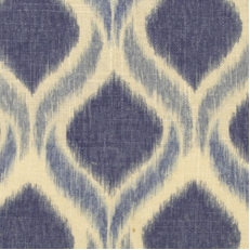
From strong and steadfast dark tones to light, cheerful shades, blue is universally appealing to both men and women. Next year, we’re excited to try mixing multiple blues together–like this Duralee ikat fabric–to create a deep, calming look.
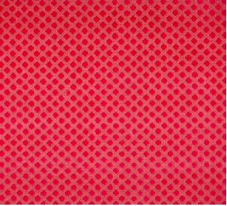
Hot Reds
Reds, oranges, corals and rosy pinks–these bold hues are sometimes best used in small doses. Design tip: When you have a really bold red, such as this Scalamandre fabric below, use a cool blue to tone down the heat of the color, or try mixing multiple shades of pink and coral for a cheerful, upbeat palette.
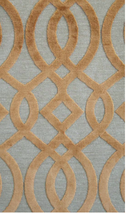
Smoky Neutrals
With a focus on mushrooms and caramels, these neutrals are anything but bland and boring–especially when they include tonal patterns similar to this Osborne & Little fabric. They can be mixed together for a peaceful, relaxing look or be used as backdrops against pops of color.